This is an excerpt from the Web UI Design for the Human Eye ebook, written by Jerry Cao, Kamil Zięba, Krzysztof Stryjewski, Matt Ellis, and originally published on UXPin.com.

Designing for Space: Sculpture Through Subtraction
Effective use of space in UI design requires an understanding of aesthetics, functionality, and human behavior. In fact, spatial design is the link between the more stylistic dimensions of language and visuals, and the more practical ones of responsiveness, time, and user behavior. Space exists somewhere in the middle, dealing with issues on both sides of the spectrum.
We’ll start our discussion on space by talking about it in its purest form — white space — and why you shouldn’t fear it. Then we’ll get into more practical tips on how to treat space so that your interface doesn’t feel cluttered or isolated.
Negative Space Is Not Negative
White space can be daunting. As we discussed in Web UI Best Practices, white space can feel like an empty canvas — something that you must replace with your brilliance, otherwise, you’re not doing your job. But the truth is something completely different: the designer’s job is to create the best interface and experience possible, and that means using white space as just another design tool.

All good visual artists understand the importance of negative space, the empty area that draws attention to, and accents, the actual subject. Negative space (the artistic equivalent of a designer’s white space) is like the supporting cast whose duty is to make the star of the show stand out more by not standing out so much themselves.
If you don’t think any part of your design should be intentionally blank, take a look at the World’s Worst Website Ever for an extreme example of the damage caused by too many objects competing for attention.
In interaction design, white space serves three main functions: improving comprehension, clarifying relationships, and drawing attention.
1. Improving Comprehension
If cluttering your interface overloads your user with too much information, then reducing the clutter will improve comprehension. In fact, properly using white space between paragraphs and in the left and right margins has been proven to increase comprehension up to 20%, as pointed out by Dmitry Fadeyev, Creator of Usaura. The skill of using white space lies in providing your users with a digestible amount of content, then stripping away extraneous details.
White space can be broken down into four elements:
- Visual White Space — Space surrounding graphics, icons, and images.
- Layout White Space — Margins, paddings, and gutters.
- Text White Space — Spacing between lines and spacing between letters.
- Content White Space — Space separating columns of text.
Let’s take a look at how these four elements create a sense of harmony and fluidity.

Medium is a great example of striking a nice balance with all 4 elements of white space.
First, let’s think about the goal of the user from an interaction standpoint: they want to access interesting content as quickly as possible. The homepage immediately facilitates that goal by placing content front and center, with plenty of white space on either side to add emphasis. There is ample space around visuals and between lines of copy, although the padding around images could be more uniform (notice how the space to the left of each image is not consistent with space below).
Beyond improving comprehension, white space also helps create mental maps. Minimal white space is used between the top navigation and content stream since both serve similar functions in driving the user deeper into content (and similar functions should be grouped together). Because the right-side navigation focuses more on creating and saving content, more white space separates it from the content stream. In this case, white space helps users assign different functionalities to different parts of the interface.

Once you click through to an article, white space helps focus the user on what they care about most: the content. Notice how the extra spacing between each line of text improves readability. On a subtler note, the space around the JW Marriott logo calls attention to the brand without feeling intrusive (a perfect counter-argument against the “Make the logo bigger!” remarks).
Just like the homepage, you can see that plenty of white space once again creates distance between groups of objects that serve different functions. For example, notice the amount of space between the primary content and the commenting/ favoriting/ share features on the bottom right.
Ultimately, proper use of white space eliminates waste in your interface. Each interaction with the user, therefore, feels necessary in helping them accomplish their goal. Think of it as what we described in The Guide to Mockups as “subtractive sculpture.” As you remove more stone, you create more space and emphasis for your sculpture:
You start out with a big slab of rock and slowly chip away to get the rough shape of the form you’re creating. You take another pass at it to get a better sense of the object you’re trying to extract from the stone. You take another pass to start getting a bit more detailed. Eventually, you start honing in on a particular aspect of the form: a face, the arms, or the torso. Slowly but surely you detail each section of the sculpture until you’ve arrived at the final form.
2. Clarifying Relationships
When observing how individuals organize visual information, Gestalt psychologists stumbled on what they call the Law of Proximity, which states that images near to each other appear similar. For example, take a look at this picture.
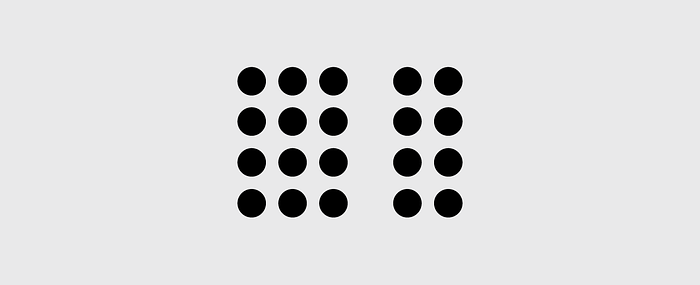
Almost everyone sees 2 groups of dots, rather than simply 20 dots. The dots are all identical and the only thing differentiating them is the white space that separates them. This behavioral observation has several important applications to interaction design, especially with regards to input forms:
1. Place labels closest to the relevant fields — As you can see in this example, information is communicated far more clearly when labels are placed closer to the fields they relate to.
As described in Web UI Best Practices, research has shown that even the slightest hesitation can hurt form completion. In this case, merely adjusting the spacing increases the user’s confidence in filling out the form, which of course improves completion rate.

2. Group related topics together — When dealing with long forms, the task of filling them out can seem so overwhelming, some users will quit before even trying. Breaking the information up into appropriate groups can help make it feel more manageable.
As you can see in this image, in the form on the right, just categorizing the 15 fields into 3 groups makes the process feel easier. The amount of content is the same, but the impression on users is much different.
Form fields usually present the most friction to users, but the same principles can also apply to navigation and site content. Instead of a top navigation menu with 20 items, you can create a dropdown menu with 4–7 top-level items and the rest categorized under submenus.
3. Attracting Attention — As we’ve mentioned before, the lack of other elements will only make existing elements stand out more. Let’s take a look at our redesign of Yelp below (pulled from our free ebook User Testing & Design).

In the above high-fidelity prototype, we added plenty of white space to separate the categories from the search function. In doing so, the category icons are much more noticeable (and less cluttered than their current vertical format). Combined with an animation-like color fill that’s triggered on hover, the category section now attracts even more attention while providing better feedback to the user.
But because humans have a selective attention that leads to tunnel vision — like tuning out banner ads (known as banner blindness) — you also need to know when spacing between content should be reduced and altered.
For example, in the above left image from Westfield London, the retailer wanted usability consultant Jakob Nielsen to show a timeline of events via lightbox popups. But the design on the left fails because the year “2000” went unnoticed. Users are instead drawn immediately to the image and body copy. Luckily, in the new image, a quick and simple adjustment to the placement of “2000” solves the problem.
Ultimately, you need to understand that the power of white space comes from the limits of human attention and memory.
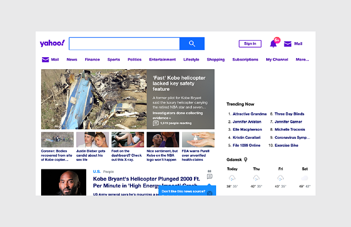
Just look at the comparison between Yahoo and Google below. Yahoo tries to get the user to consider too many actions at once. Google understands the bottom line that people just want to use search engines to find stuff. By being realistic about the user goal, Google’s design encourages more effective interaction.

Chunk Your Content
Most designers subscribe to the “don’t make the user think” school of thought.
It’s not that users are just lazy, it’s that they already have a lot on their mind, and cramming extra information just makes it harder to complete their tasks. The amount of strain an interface design creates is called “cognitive load,” and a usable and enjoyable UI will reduce this as much as possible.
As complicated as the human brain is, its shortcomings are surprisingly predictable. Take the studies of George Miller, for example — in 1956, the scientist released his findings that our short-term memory can usually retain data of between 5–9 items — an average of 7 — before forgetfulness sinks in. While the exact number has been contested (3–6 is the current ideal), Miller’s findings have proven effective and led to important IxD methods, including “chunking.”
Chunking is the practice of grouping relevant information together to make it easier to process and remember.
However, chunking has since been overanalyzed and misinterpreted, looking nowadays as something more like a superstition than a best practice. For example, some designers insist that menus, dropdowns, or bullet lists should never contain more than 6 items — but this is not recommended use of the practice.
Chunking is not a hard-and-fast rule, but one that depends upon the context. In brief, chunking is ideal for the following situations:
- When your product naturally requires a great deal of information that must be memorized for later use.
- The UI must compete against external stimuli for your user’s attention (mobile apps, for example ).
- E-learning applications (since users must later recall the information).
On the other hand, you don’t need to chunk your content if it’s meant to be searched or browsed. There are exceptions, of course, as you can see below with Etsy.

While users don’t need to memorize the categories, chunking out the content on the category-level adds visual hierarchy. Once you click into the category, the chunking disappears and the items are listed. It wouldn’t make sense to apply chunking at the item-level since you can understand the frustration from browsing only 5–6 items per page.
Etsy’s treatment allows users to enjoy the best of both worlds. A large number of products are presented, but users don’t feel overstimulated. In the example above, there are 32 different products on the screen. Using any other design, the user could feel lost or distracted. Thanks to chunking, users can process all the information while honing in on the “chunks” that most interest them.
Takeaway
Space can either take away or add value to your content — it all depends on how you use it.
Create too much space between related interface objects and your design becomes frustrating. Cram too many objects together, and your design becomes too cluttered. Pay attention to space when creating your layouts, particularly its relationship to user memory and how proximity can convey meaning better than a wordy explanation. Space holds a lot of weight in interaction design — which is saying a lot for something that is technically nothing.