Web UI Design for the Human Eye: Content Patterns and Typography — Part 2
This is an excerpt from the Web UI Design for the Human Eye: Content Patterns and Typography ebook, written by Jerry Cao, Kamil Zięba, Krzysztof Stryjewski, Matt Ellis, and originally published on UXPin.com.

Designing for Scanning: Z-pattern
In the last chapter, we explained how the F-pattern is the natural eyesight trend when users encounter text-heavy pages. But what about pages that are less content-heavy?
Think of the Z-pattern as the sister to the F-pattern. Both are naturally occurring eye patterns, as validated by eyetracking studies. The difference is in the type of content the user encounters. Usually, content-rich pages will trigger the F-pattern while pages with strong primary content are more suitable for the Z-pattern.
What is the Z-Pattern?
Where content is more spacious — or at least organized looser — a user’s sight will typically follow a pattern like the letter Z.
Like the F-pattern, the reader first scans a horizontal line across the top of the page, whether because of the menu bar or simply out of a habit of reading left-to-right from the top. When the eye reaches the end, it shoots down and left (again based on the reading habit), and repeats a horizontal search on the lower part of the page.
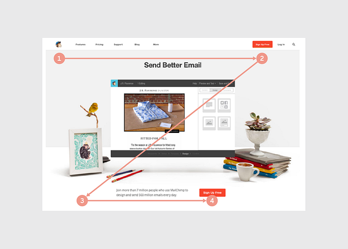
The Z-pattern is perfect for interfaces (like Marketo above) where simplicity is a priority and the call-to-action is the main takeaway. In short, the F-pattern organizes content, the Z-pattern emphasizes calls-to-action.
It’s easy to confuse the F- and Z-patterns based on looks alone, as they both are organized into horizontal rows. The key difference is in how the eye moves downwards. Once the F-pattern is triggered, the user will scan a straight vertical line down the left side until it reaches something of interest. The Z-pattern, on the other hand, will more or less cover every line, which is why it mostly applies to pages that feature a small enough amount of content to make this feasible.
How to Use the Z-Pattern
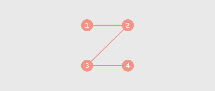
We’ll again use a visual aid from Brandon Jones’s post to explain the Z-pattern.
Using the above graphic, we can break down the Z-pattern into its key areas (based on Jones’ analysis).
It begins the same as the F-pattern: starting at the upper-left-hand corner (Point 1) and moving horizontally all the way to the right (Point 2). As with the F-pattern, Point 1 is the most valuable spot, which is why it almost always houses a company logo. Again like the F-pattern, Point 2 is a great location for a call-to-action — however, not the main call-to-action, as we’ll explain below.
The Z-pattern then deviates on its own pathway. The prime area of the Z-pattern is the center of the page, the large expanse where the eye scans on its way down to the second row. The trick to this area is fill it with content that interests the user, while still urging their sight downward to the next line. This space usually hosts an image or an image carousel; something that will maintain user interest, but not enough to stop them from continuing to browse the site.
The user then again scans the next row horizontally, left-to-right (Point 3 to Point 4). Here is the main appeal of the Z-pattern; think of this layout as a minor build-up leading to Point 4. This is the spot where you want to put your most valuable content, usually a call-to-action.
Because Point 4 is the finish line, the row between it and Point 3 should contain content that pushes the user’s sight to the corner. This is an excellent place for a series of smaller gateways to other sections. Basically, the goal for this row is to incite title scanning, drawing the eye ultimately to Point 4.
Another important factor of the Z-pattern is the background: you should separate it from the main framework as much as possible. The Z-pattern relies on its structure to achieve results, and a flashy background distracts the user. Keep backgrounds simple and muted.
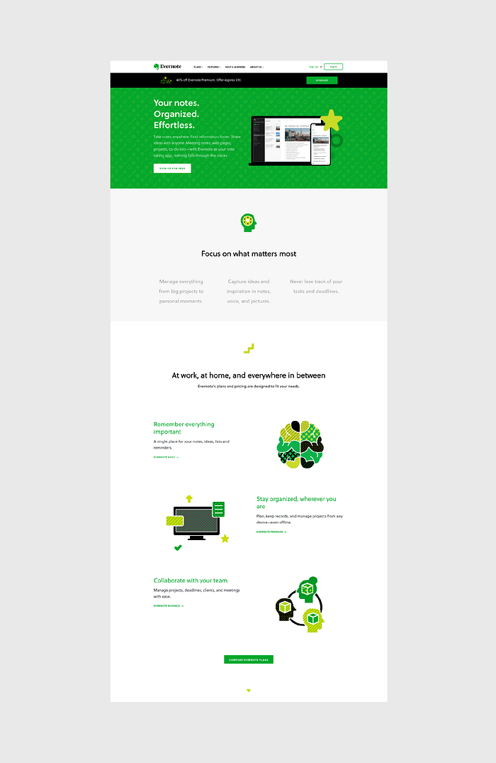
The Z-pattern can even extend throughout the entirety of the page, repeating Points 1–4 if you feel that more value propositions are needed before the call-to-action. As you can see above, this is exactly what Evernote does by starting with a “Sign Up Now” call-to-action, guiding users through a few selling points, and finishing their repeated Z-pattern with payment option calls-to-action.
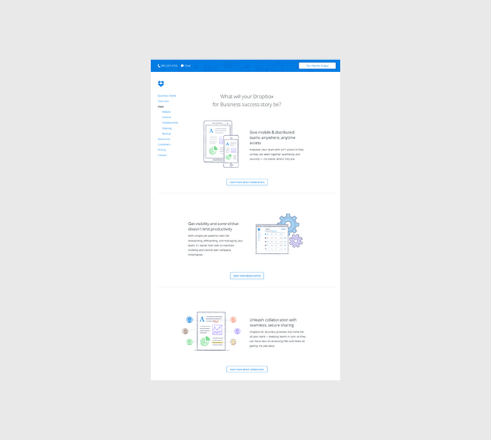
DropBox takes a visually simpler approach to this zig-zag pattern by doing away with any background images altogether. Instead, more functionality is built into the layout since a “Learn More” call-to-action connects each section of the winding pattern as your eye makes its way down the page. This also helps informed readers click to the next relevant page without needing to read all the copy first.
Why Is This Pattern Effective?
The Z-pattern is popular amongst designers because it adheres to the central tenements of web design.
There is a visual hierarchy and premeditated structure, plus it opens key visual pathways to both a brand and a call-to-action. While the F-pattern follows a route more organic to natural eyesight trends, the Z-pattern is a bit more refined for storytelling purposes (since you lead the user as they zigzag from point to point). .
Another benefit of the Z-pattern is its versatility. The central image can be enlarged or shrunk, the pattern can be repeated any number of times (to accommodate several different calls-to-action), and the content in each row can be anything that follows the unifying structure.
The Z-pattern’s fixed structure can also be its drawback. As a layout designed to control a user’s sight, it’s susceptible to unplanned distractions and anything that knocks the user’s vision off course.
Remember that your user’s eye will always be attracted to the biggest and brightest elements on a page, so if you’re designing for the Z-pattern, make sure your complementary elements are entertaining — but not overpowering.
Takeaway
Both the F-pattern and the Z-pattern are widely recognized web design strategies, but each for different reasons. Determine the main goal of your site first and foremost — if it must organize a large selection of content, choose the F-pattern; if it leans towards eliciting a specific action as a result of visual narrative, choose the Z-pattern.
If you’re designing for the Z-pattern, don’t forget its emphasis on structure. Know where the key points are located, and how they’re best used. Remember to keep secondary content subdued so you don’t “derail” your user’s sight pathway, and don’t be afraid to take advantage of the layout’s versatility.
Creating Visual Language Through Typography
Form equals function, and that doesn’t change just because we’re dealing with text.
Typography is the aesthetics behind the written word, the art of making your text serve a purpose-based only on its looks. This incorporates many different physical options — font, size, color, position, etc. — and also external factors like what’s being said, how it’s being said, and the context surrounding it.
First, we’ll talk about how the content and context of what you’re saying should affect the look of the words, then we’ll discuss how to utilize the various visual elements, and we’ll close by offering some helpful tips.
Many Languages Within a Single Word
Just like many other areas in design, content is still king in typography. Ultimately, the meaning behind the words you’re communicating will affect the look of the text. Knowing the intention behind the message is the first step in the process.
A message’s emotion or tone is more important than the words themselves. Gunther Kress and Theo van Leeuwen summarize it best in their book Reading Images: The Grammar of Visual Design when they say:
The visual component of text is an independently organized and structured message, connected with the verbal text, but in no way dependent on it and similarly the other way round.
This signifies that every printed word can communicate two separate meanings: the literal definition and the emotion suggested by the typography. According to Caroline Knight and Jessica Glaser, your typographic choices create many layers of meaning.
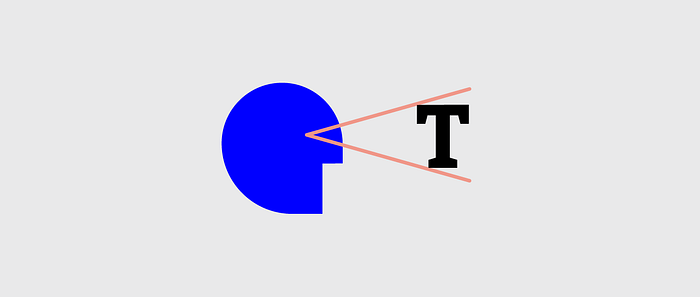
In their first example, the word STOP seems imposing and loud. The impression is one of interruption and carries a sense of urgency. This effect is not an accident.
Let’s look at the elements at play here.
For starters, the text is large and all-caps, which is a quick and easy way to add gravity to any word. The subtler choices just support the tone: the font choice is simplistic and no-nonsense; the letters are thick tightly spaced, creating an oppressive block of text. The color scheme of white against black corroborates the directness, while the dominant black “negative space” lends more immediacy to the message. Lastly, the position of the word in the center makes it seem more worthy of attention.
A counterpart in this image.
This version is far less intense.
It seems less like a command and more of a gentle suggestion to be taken at your leisure. The text is small and lower-cased for starters, and on top of that has a more detailed font, with slight italics — the text here is more whimsical. The script typeface feels like a refreshing break from the monotonous black background, creating an oasis of elegance. The position at the bottom-right corner, the last seen position on the screen, makes the message seem almost like an afterthought.
Same exact word. Two completely different meanings.
The Importance of Context
At its core, typography is just another tool for communication. As such, context will play a large role in its success or failure. Typographic context is determined by two factors:
The Readers — Who is reading your words and how are they likely to interpret different visual cues.
The Type of Message — Distinctions between blog posts, banner ads, product descriptions, etc. will all affect interpretation, not to mention the different types and styles of each of the above.
Let’s explore both below.
1. The Readers
The first concern of context in typography is who will read your message. Different people interpret the look of the text in different ways, just as they would interpret a painting in different ways.
For this, it’s important to reference your user personas. We discussed user personas at length in Interaction Design Best Practices: Volume 1, but to summarize, a user persona is a character made up to represent one of your target users. When making important design decisions, personas act as another person in the room to think about. “Would Sally Perkins (a seasonal shopper) see this link in the corner?” for example.
When crafting your typography, keep your user personas in mind. Will they understand the intentions behind your creative choices, or will it go over their heads? Which kind of typeface would be most effective on them? Just as other areas of design, knowing whom you’re designing for will answer a lot of questions early on.
Glaser and Knight, for example, explain the use of the Old Gothic font, as in the Juicy Couture. To the brand’s loyal followers, this font denotes youth, a certain edginess, even unapologetic sex-appeal.
However, an older or less fashionable audience would have a completely different association. They tend to interpret the font as more sophisticated, classy, or traditional — not at all applicable on the backside of yoga pants! This audience would make more sense out of the New York Times logo below.

The differences aren’t always this extreme. Even within your target audience, differences in age, gender, social status, etc. will all have subtle effects on the typography’s interpretation.
When it comes to judging the aesthetics of the typography, we recommend writing down (or at least reviewing in your head) the top 5 words that immediately come to mind. Make sure it correlates with your audience and design objective, otherwise keep searching.
2. The Type of Message
Are you designing typography for an advertisement or an error message? If it’s for an advertisement, what kind — charity, luxury goods, candy? Is the ad funny or serious?
Just like you need to know who you’re writing for before you start, you should also know why you’re writing. You’ll need to make sure your typography is in sync with your overarching message.
Let’s look at TDBank and how they create different impressions with the same sans serif font.
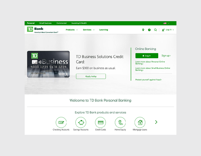
It makes sense to use a straightforward, but approachable sans-serif typeface like this for the bank homepage. The design isn’t particularly innovative, but it certainly creates a basic level of trust since the typeface is crisp and the green colors suggest wealth and serenity.
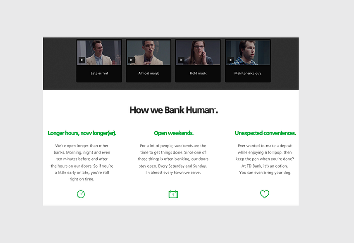
The typeface becomes much more interesting on their microsite discussing how to humanize banking. Presented in a larger size and bolder weight, the font lives up to the messaging of “banking human”. It’s professional, tastefully modern, and feels like a friendly advisor. The green color is also brighter and livelier than on the homepage, adding to the human feel.
The point here is that the same font serves two different purposes depending on where it’s used. The bottom-line voice from the main site comes across much happier on the microsite, just as the bottom’s hopeful optimism doesn’t come across on the top.
You don’t want to take this visual correlation to an extreme, however.
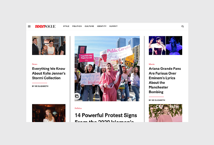
For example, let’s take a look at Teen Vogue. It’s safe to say their audience consists mostly of tweens, but their site design feels more aspirational than immature. The typeface strikes the perfect balance between youth and elegance.
They don’t make the mistake of literally matching form and function. For example, the designer could have gone with a more literal appeal with something fun and quirky like the below font, appropriately named “CK Tween”. But such a treatment would feel contrived and tacky, leaving a saccharine aftertaste.
Match the typeface to the desired mood, but exercise restraint or it will feel cheesy.
Combine Copy and Typography
We started this chapter explaining that a word’s literal meaning and typographical meaning are two completely different things, but that doesn’t mean they can’t work together. A word’s look and definition can complement each other when done right, heightening the intention beyond what each could accomplish on their own.
But word choice goes beyond mere meaning. When writing, think carefully about the lesser-acknowledged properties of words, such as:
- Length — How many letters? How many syllables?
- Sound — Rhyming can be an influential tool, so look for opportunities to use it.
- Shape — Which letters make up the word? What is the word’s outline?
Beyond the audience and design objectives, you also need to balance legibility with readability. Legibility refers to the design elements such as the width of strokes, the presence of serifs, etc. Readability, on the other hand, is how the content, font color, legibility, leading, tracking, and all other elements combine to create an overall impression.
Graphic Designer Douglas Bonneville provides straightforward and effective advice on choosing and using typefaces. Let’s expand on some of these insights for legibility and readability.
1. Legibility
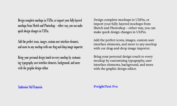
Decorative typefaces (like Calligraffiti below on the left) have poor legibility because they’re designed to be glanced, not read. Meanwhile, serif typefaces like Crimson Text below on the right are much more legible and practical for content.
Think about where you typeface should fall between the two extremes above, then keep these tips in mind:
- Select sleek and crisp typefaces — The more ornamental and artistic the typeface, the higher the cognitive load as users will first need to visually process the font instead of digesting the content.
- Don’t draw attention to the typography — Your typeface treatment should certainly be elegant and aesthetically pleasing. But don’t forget its role is accentuating content, not competing with it.
- Keep it balanced — Typography is all about the balance of elements. If your font size is small, make sure you select a typeface with a larger x-height. If your background is grey, use white instead of black for the font color. When in doubt, opt for regular or normal weights.
For a quick set of guidelines for font legibility, check out this helpful excerpt from Web Style Guides.
2. Readability
A related concept to the F-pattern and Z-pattern, readability affects how much users actually want to engage with your content. Unless low readability is part of the message you’re conveying, make sure to prioritize communication over style.
Let’s take a look at an example based on graphic designer Douglas Bonneville’s piece on how to select typefaces.
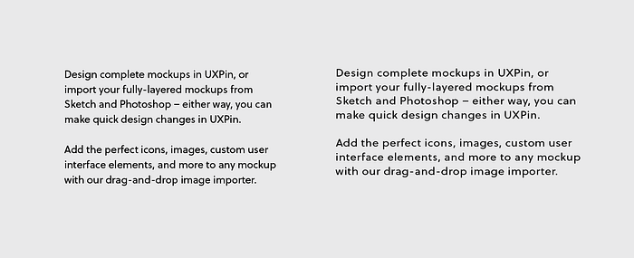
The version on the right features decreased font size, lightened colors, full justification, and some tweaks to the leading and tracking. As a result, it’s much less readable.
In order to keep content readable like the example on the right, keep these tips in mind:
- Match the typeface to its role — Some typefaces are better for headlines, while others are more flexible and are still readable at smaller sizes. It’s not a bad idea to pair a more fun font (like Knockout) for headlines with a highly readable font (such as Tisa or Proxima Nova) for the body copy and microcopy.
- Keep the measure in mind — As a general rule, your line length (also known as the measure) should be set to 60 to 70 characters. If your measure is too generous, users may have trouble reading from line to line.
- Create breathing room with proper line-height — To prevent text lines from crashing together, we recommend setting a line-height between 1.3 to 1.5.
Takeaway
It’s tempting to think of typography as an extension of the site’s writing, but that’s not accurate. Nor is it accurate to think that the two are completely unrelated. The truth is that both are separate fields, each with their own best practices; however, the two are always intrinsically linked, and so each should be designed with regards to the other one.


