Rachel: In this video, we’ll dive right into the UI of UXPin. First things first, let’s create a new project.
We’ll come up here to the button and we’ll press that. Now, I’ve got an exciting project in mind.
🎉 Let’s create an employee portal.
This is a layout where we can truly explore the power of UXPin Merge.
We’ll name our project Employee Portal and we’ll click “Create New Project.“ And just like that, we are in the editor.
Now, this is where the magic really happens. But before we get too carried away with our employee portal, let’s take a moment to understand the UI of UXPin. It’s like the control center of our creative journey. If you’re familiar with UI or UX design tools, then this will look very familiar.
Let’s have a look.
There are five main areas:
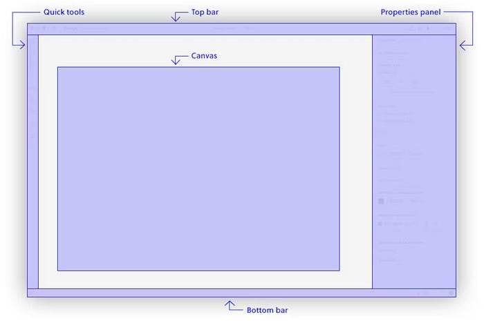
- the top bar,
- the bottom bar,
- the quick tools,
- the properties panel,
- the canvas.
Top Bar
Let’s start with the Top bar. This is our command center. It houses the tools and options and will adapt based on our selection. Starting on the left, you can navigate back to the dashboard, and you can switch between prototypes, and you can also toggle between design and documentation modes.
In the middle, we have the name of our prototype, which we can change later, as well as some options. On the right, we have prototype actions, which allow you to share or preview your prototype, and there is also some zoom options.
Properties panel
Now, moving down to the Properties panel on our right, this is our customization station. It allows you to tweak the properties of any element in your design, ensuring that each design aligns perfectly with your vision. The contents of this panel will largely depend on the element that we’ve got selected.
For example, we have nothing selected right now, so we get the customization options for the design in general. We can, for example, change the canvas size to iPad, since we’re going to be designing the employee portal for an iPad.
Quick tools
Let’s swing over to the Quick tools on the left. This is your toolbox, providing quick access to frequently used tools for efficient designing. We can see some really familiar design tools like the rectangle, the pen tool, or the text tool. But since we’re working with MUI components, we won’t actually use these tools much.
Bottom bar
Next, the bottom bar. On the left, you’ll find access to the Pages and layers panel and the Design system libraries panel. We’ll use these panels a lot, so we’ll come back to them a little later. And on the far right of the bottom panel, you’ll see the view settings, accessibility settings, the autosave indicator, and the help menu.
Canvas
And finally, the center of it all is the canvas. This is your design space, where we’ll use to build our employee portal app design.
Navigation shortcuts
A quick tip for navigating the space is to get really familiar with the zoom and pan shortcuts. To quickly zoom in and out, hold down the command or control key and scroll up and down with your mouse’s scroll wheel.
To quickly pan around the canvas, hold down the space bar and then click and drag with your mouse, like so. And we can see it a little bit better this way. Now these shortcuts are super helpful for you to navigate around your design quickly.
Where to find ready-made UI components in UXPin?
We’ll be working mostly with the first tab, the MUI components, so let’s click through to that one. This is where we’ll find and use all the React-ready MUI components.
On the bottom left here, we can see that we’re looking at MUIv5 components. Click on this and we’ll be able to see all the UXPin libraries that are available to us.
Below them, you can see classic libraries. Let’s click into one of them. Let’s say “foundation.” As you can see, these are more traditional design systems which include color, typography, assets, and components built from these assets. Now, these components do not have built-in interaction and code, unlike the super cool Merge libraries that we’ll be playing around with.
We’ll be sticking with MUIv5 under the Merge Libraries section. So let’s select that one again. Now, we’ll get more into MUI and MUI components in the next video. But for now, let’s have a look at how the user interface changes when we’ve got a component on the canvas.
How to use ready-made UI components in UXPin?
While we’re here, let’s search for a card component, and we can click on it to put it on the canvas. Let’s zoom out a little bit and pan it down. Now, let’s make sure it’s selected by clicking on it. You can see when we click on and off it that there is an orange outline that appears. So when there’s an orange outline, it is highlighted and it means that it’s being selected.
Instantly, you can see that there are some UI changes.
The Top bar now features the name of the component on the left, and there are some new icons in the middle. These icons allow us to group, fill with data, bring to front, and bring to back. When we group multiple items together, we can treat them as one grouped element. This bring to front and bring to back buttons allow us to bring the selected elements to the visual front or the visual back of the elements displayed.
For example, if I put another card here and I sort of put it just above it, I can make sure it’s selected. And if I press this to back button, it will bring it to the visual back behind the original card. And similarly, if I press this to front button, we bring it to the visual front in front of the original card.
So let’s put this one aside for now.
Importing data
Now, this “fill with data” button is quite special. It allows us to populate this particular element with data from a JSON, CSV, or Sheets file. This is particularly useful if you have a ton of data like users or avatars, and you want them to be a part of your design.
Aligning components
The Properties panel now looks a little different as well. The first thing that we have on the top are the alignment tools. These tools align our selected element to the canvas, or they align selected elements to each other.
Let’s zoom out so we can see the entire canvas. And let’s select the first card, and we’ll play around with some alignment tools. Now, this first one, Align Left, will align our card to the far left of the canvas, like this.
Align Right, Align Top, and Align Bottom all do a similar thing. But we also have Align Center and Align Middle. Now, these will align the element to the vertical and horizontal center of the canvas, like this. If we press Align Center, it goes to the center, and if we press Align Middle, it goes to the middle.
But what about these last three that seem to be deactivated? Well, these are reserved for when multiple elements are selected. To best demonstrate this, we’ll create a third card by dragging one out to the canvas, and then we’ll select all of our cards, to check out what these buttons do.
First, we’ll want to select all the cards. And I’m doing this by clicking and dragging over all three cards. And you can see that they’re all selected now with that blue highlight. You can also do this by clicking on one and then holding down Shift and then clicking on the other ones.
Now, we’ll explore these alignment ones first. They do a similar thing as before. However, instead of aligning to the canvas, we’re now aligning the elements to each other. So for example, if we click on Align Left, all the elements will be aligned to the far left of the left-most element like this.
Now, if we try to align to the right now or align to center, they do nothing because they’re all already aligned to the right or center of each other. So let’s undo that action so we can see the cards all sprawled out again.
Now, I’m going to move these a little bit to showcase this next one. Now let’s try aligning the elements to the top of each other. So let’s select them all and then press “align top.” Now this time UXPin has aligned all the elements to the very top of the topmost element. Let’s undo that again so we have our sprawled out cards.
Distributing components
Now that we’ve got three elements, let’s select them and we can play with the final three buttons. The first is distribute horizontally. Now I’ll move our cards around a little bit just so I can showcase this better. Now we’ll select them all and then press distribute horizontally.
This spreads our three elements out so they are evenly distributed from left to right. There’s even this nice gap between them, which we can adjust by changing this value here. Now what I’m doing here is I’m clicking down and then dragging left and right. It’s very handy.
Next, we have this vertically distribute. Now to showcase this again, I will move these guys around a little bit and zoom out so we can see. I’ll select them all and press “distribute vertically.” Now this feature spreads our three elements out so they’re distributed evenly from top to bottom. Now we can even press this Align Center button so they’re all aligned to the middle.
Finally, we have this “distribute on grid.” Now, you may have noticed by now that sometimes we have these pink elements. We’ve got this pink circle and this pink line. This is because they’re part of a smart grid. Now, if we click and drag one of these pink lines, yes, we can see that the spacing between all of our cards change at the same time. This distribute on grid button redistributes selected elements so they’re spaced evenly apart and therefore qualify for the smart grid.
For example, if we move this middle card off to the side and down a bit, we can see that the three elements are no longer applicable for the smart grid. There’s no pink elements. However, we can now click on this “distribute on grid button.” This element here has now been moved up, and we can see our pink lines again, like so. Now, we don’t need all three cards for the next bit, so we’re just going to delete two of them.
More features of properties panel
Okay, we’ll get this selected again, and we’ll move down our Properties panel. Here we’ve got the dimensions and the position of our element. We can manually adjust it like this, but we can also use these buttons to the right. The first one will automatically resize the element to fit its contents, like this. In our case, our card becomes much wider to accommodate for the size of the image. We’ll turn that off.
The second one will turn on responsive width which will automatically scale to the width of the container, in which case it’s our iPad. We can see this in action if we change the canvas size. Deselect the card, and then, come over here to canvas size, and change it to iPhone 8.
We can see that the card has now been rescaled to fit the width of the iPhone 8 canvas. We’ll change this back to iPad for us. Whoops, change it back to iPad. And then we’ll also turn this off for now. Put it in the middle.
Finding official documentation
Moving down, we see this gray box that contains information about this component and the fact that it’s a MUIv5 component. There’s even a little button that takes us directly to the MUI docs page for the card component.
The rest of these options are specific to the card component, so we’ll save that for the next video where we’ll have a look at MUI components and their options.
Customizing MUI components
What’s great about UXPin Merge is that we can further customize these MUI components and nest them within each other, just like we might do so in React.
Let’s say I want to add the MUI rating component to this card. I simply have to find it. Let’s find it up here. We’ll type, we’ll search for rating, and we’ll click on it to add it to the canvas. Now, we can also see the rating component up here. It’s not part of the card component, but we want it to be.
Let’s click on it and drag it between these two typography components. And we can see that it pops into the card just like that. Now, clicking a component directly from the Layers panel like this is actually only one way of selecting it. We learned earlier that clicking on the card from the canvas will select it, but we can also select any of its children by double clicking.
For example, we can double-click on this card header component here to select it. You can see that this is the case because over here in the panels, you can see that the card header is selected. Now, we can do this as many times as we need to depending on how nested the component is.
For example, if we want to come to this trends typography component, we’ll have to double-click on the card component and then one more time to the typography component. Now, you may be thinking that’s a lot of clicking and you’re totally right. There’s actually a much faster way that I only discovered a few days ago. If you’re on MacOS, you can hold down the command key and hover over these elements and they’ll get highlighted.
And you can click on the element you want and that nested child component will be selected right away. And there’s also one more way. If you right click on your desired element and then hover over select layer, you can select the one that you want and we want typography.
It’s up to you what method you want to use to select any of the child components. I personally like the command click method because I can select any element in one single click and all these layers also open up on the left. So if we close card content and then we come and select trends, this opens up and we can see all the children. So now we’ve got an element on the canvas.
Now what?
So far, everything’s been quite standard for a design tool. Now the magic happens when we preview our prototype. So with our card front and center, and actually let’s use our alignment tools to put it front and center, very nice.
Spec mode in UXPin
With that now front and center, let’s head up to the top and preview our prototype. Now this will open another window. Once it loads, we can see our canvas and we can see our MUI card component.
This is the view in which we can see our prototype. This top bar here now features three different modes:
- There’s “Simulate,” which allows us to go through the design without any distractions.
- Now “Comment” allows us and our team to leave feedback like this, or to go through other people’s comments.
- The “Specs” lets us explore the design in more detail. We’ll go into this in more detail in a later video.
Let’s head back to “Simulate.”
On the far right of the top bar, we can adjust zoom settings. There’s preview on a device. handle interactions, full screen, or responsive mode. Now, since we’re only designing for an iPad at the moment, we won’t have to worry about responsive mode. And what’s really cool here is the ability to preview your design on a device. So you click here, and if you want to and you have UXPin Mirror on your device, like your tablet, you can scan this QR code to check out and preview your design on a tablet.
This looks like a regular UI design until you start interacting with a component. Now, because we’re using React components, all of these elements retain the behavior of the actual React component by MUI.
For example, these rating stars can be clicked by the person seeing the design and they will retain state as well. And if we come down here to the button, we can see that when we click it, the little circle originates from wherever our cursor was clicking, which is a MUI thing.
Now we can head back to the design by closing this prototype window.
What to expect?
The MUI rating and button components are just the tip of the iceberg. MUI has so many React components as part of its library that we as developers can take advantage of within UXPin. We’ve just scratched the surface of UXPin’s powerful UI using the merge feature and the MUIv5 React component library.
As we explore further in the next video, we’ll delve into MUI components, their customization options, and how UXPin makes the design process seamless for us React developers.
I’ll catch you next time.

