UX Design Process Best Practices: Documentation for Driving Design Forward — Part 1
This is the UX Design Process Best Practices ebook, written by Jerry Cao, Ben Gremillion, Kamil Zięba, and Matt Ellis, and originally published on UXPin.com.
Design UI with UXPin Merge — a prototyping tool that allows you to build UI with your devs’ UI components. Get specifications like dimensions, accessibility guidelines, and behaviors and streamline handoffs. Request access to UXPin Merge.
Minimizing UX Design Busywork
The days of documentation for the sake of deliverables are over.
That’s not to say that documentation is no longer relevant — quite the opposite, it’s more important now than ever before.

The main point to keep in mind is that design documents should complement, not supplement, the design process.
Documentation must be actionable. It must have a purpose beyond creating a paper trail. The best design documentation both enhances the design process and communicates design thinking to others. If a UX document accomplishes this, its benefit to the project will be seen immediately. If not… then it’s just busywork.
In this chapter, we’ll give an overview of the design process and how documentation can make it better, instead of just busier.
A Quick Overview of Design Thinking
Design thinking is a strategy that uses the traditional tactics of design to solve problems. It accomplishes its goals from the inside-out, instead of trying to break in from the outside. As Tim Brown, the CEO of IDEO and stark promoter of design thinking, explains it:
“Design thinking can be described as a discipline that uses the designer’s sensibility and methods to match people’s needs with what is technologically feasible and what a viable business strategy can convert into customer value and market opportunity.”
In essence, design thinking adheres the classic business adage, “build the right thing, and build the thing right.” This means, first off, making sure you’re designing a product that people want, and then making sure you design it in such a way that people like it. Notice that both of these goals revolve around the end user.
In design thinking, the product is designed around what the users want and need.
As a business ideology, design thinking is catching on. Even engineering-driven giants like IBM are abandoning their old ways and adopting a more design-centric method. They’ve hired thousands of designers, put designers in executive positions, and created their own design language.

Their new strategy comes from the general manager of design for the IBM Software Group, Phil Gilbert. This design thinker is steering the company towards what people actually want, not what executives think they should want. Gilbert believes that everyone in the process, designer or not, should “have the user as their north star.”
3 Stages of Design
Despite its creative points, all design boils down to a methodical, almost scientific approach. While everyone’s design procedure varies according to their own personal tastes or constraints, in general the process must cover three essential stages, with plenty of iteration in between:
- Research — Analyze what your users want (“build the right product”).
- Design — Create ways to give them what they want (“build the product right”).
- User Testing — Confirm your results with users, or discover what you need to change.
Often this cycle is repeated, with each iteration bringing the product closer to perfection. Moreover, the stages are always one after another. Testing should be done intermittently with design to incorporate the results in later designs.
And as for research, ideally you’ll want to know as much as you can before you start, so it should be the first step… but that said, it’s never a bad time to learn more about your users.
Design Documentation
Now that we’ve outlined the process, let’s talk about where documentation fits in.
As we mentioned above, design documentation should help solve a problem or facilitate communication among the team — ideally, both. If you’re creating a document just to have proof that you did something or because that’s the “standard process,” then you’re wasting your time.
While the Waterfall Model of design is outdated, there are some lessons we can take from its linear roots. Before we dive into the details of how to create effective UX documents, let’s start with an overview of what to expect based on the three design stages.
1. Research
The research phase is where you make sure you’re going in the right direction instead of blindly sprinting ahead. Being prepared and having a solid plan means you won’t have to backtrack as much later, so a little extra work at the beginning saves you a lot of time and effort at the end.
This is the point of the design process where you really come to understand your users. Collecting data through user research (interviews, field studies, etc.), mixed with some old-fashioned empathy, will give you a good idea of whom you’re designing for, and what they want.
Additionally, you’ll want to understand the needs of the stakeholders, just as important as the end-users. You could design the greatest product in the world, but it would never see the light of day unless the stakeholders are satisfied.
2. Documentation
The research-stage documentation can be broken up into two sections: collecting the data and what you do with it.
Collecting the data:
• Stakeholder interviews — The first thing is to understand business needs and technological parameters, and the best way to do this is to ask the sources. Both the questions you ask and the notes you take on the answers will determine how close to the mark your final product hits.
• User interviews — Just like stakeholder interviews, you need to ask the right questions to get the most helpful answers. User interviews prove invaluable for understanding the people you’re designing for, which is the cornerstone of the design process. Other options for collecting initial user data are field studies and diary studies.
• User surveys — While not as personal as user interviews, user surveys are easier to orchestrate and can cover more people — plus they are natural documentation that is easily forwarded to teams. Surveys are great for taking a quantitative approach to qualitative data. You can create these quickly with Google Forms, or use SurveyMonkey for something more complex.
• Competitive Audit — Examine the strengths and weaknesses of your competitors using an overlaid heuristics diagram. Evaluate areas such as ease of form completion, clarity of navigation, accessibility, trust factors, etc.
Showcasing the data:
• User personas — Once you have adequate data on your users, you can build fictional user personas. These act as stand-ins for the actual user during the design process, focusing more on behaviors rather than demographics.
• User scenarios — These logic exercises take personas a step further — they outline how a persona would act in a specific situation, including what pages they visit and why.
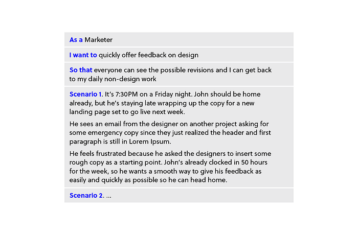
• Customer journey maps — The ultimate document for understanding your user journey, map out the personas and user scenarios at each step of the experience. User emotions, quality of experience, product weaknesses, and other factors can all be documented. Moreover, they cover customer touch points before, during, and after service so you can gauge the lasting effect of your design.
• Product documentation — While optional in the age of prototyping, documentation like product requirement documents and functional spec documents consolidate market and user research into a unified vision. ProductHunt’s documentation is a fantastic example. Meanwhile, style guides help ensure consistency and adherence to best practices during the design stage.
3. Design
Design documents are often the physical design itself. They change in both form and complexity as the design process advances, and the types of documents, including their fidelity, vary greatly.
While there are many advantages to designing quickly and creating a final product as soon as possible, that’s no excuse to cut corners. Some of these documents may feel like extra work, but each of them brings something unique to the design process. That doesn’t make them all necessary, though feel free to skip the ones that aren’t applicable to your project.
4. Documentation
• Sketches — Classic sketches on paper are one of the quickest and easiest ways to get your ideas down and share them with others, especially if you’re brainstorming.
• Site maps — Outlines of your information architecture, showing how your pages are connected to one another.

• Wireframes — These are the barebone structures of your product; dedicating time to building one allows you to flesh out your sitemap without more complex details distracting you. Lo-fi wireframes in UXPin
• User Flows — Once you’ve done enough user research, you can start outlining how the pages in your design correspond with user actions. User flows are fast shorthand notes that help you improve the efficiency of your design. You can evaluate the amount of friction at each step and minimize steps when possible. We recommend Ryan Singer’s shorthand user flows.
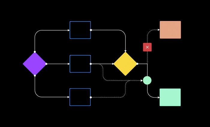
• Interactive wireframes (lo-fi prototypes) — Adding a little interactivity into your wireframe allows for early product testing — the earlier you can get feedback, the easier it is to implement. No need for complex interactions (save those for a hi-fi prototype), just make important elements clickable so people can actually use the design.
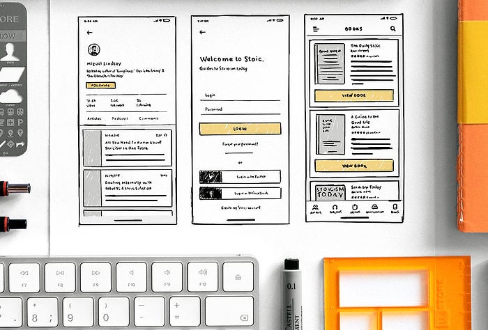
• Paper prototypes — The most basic form of prototyping to explore the efficiency and usability of your design. Good for brainstorming and inviting feedback from others due to its simple format. Requires a coworker act as the “human computer” to manipulate the prototype for usability testing.
• Mockups — These allow you to focus solely on the visual details of your product, creating a hi-fidelity reference for how it should look.
• Hi-fi prototypes — The last iterations of your product before the live version. Hi-fi prototypes are ideal for fine-tuning the interaction design and animations. If you use UXPin, the custom animations editor lets you map out animated prototypes step-by-step without any code.

5. User Testing
Usability testing is the strongest influence on design decisions. It helps ensure you aren’t forcing users into unnatural paths of behavior, and also counterbalance stakeholder feedback. Don’t confuse user testing as the final stage — usually the results of the tests lead to further research and iteration.
Don’t think this stage must only come after the designing phase. Testing should occur early and often — it should happen alongside the design process at different intervals so that the results can be integrated into further designs.
As a minimum, test between every iteration. For example, if you just finished a lo-fi prototype and you’re about to start a mockup, conduct a quick test first. You may need to tweak some functionality issues that will affect the site’s visuals.
Testing documentation can come in the form of plans, the tests themselves, and the results. Share everything among the team, so a standardized form for these documents will streamline the process (you can find some in our free usability testing kit).
6. Documentation
• Usability test plans — These outline your test goals and procedural details such as the location and time, or even the specific questions/tasks. These are especially useful for stakeholders to understand what’s being tested and why.
• User tasks — You need to describe to users the exact tasks you wish for them to perform. Be specific, avoid jargon, and don’t provide too many details on the steps needed to accomplish the task (that’s for the users to show you!).
• Usability test script — If you’re moderating the test, you definitely need a script to ensure consistency.
• Usability reports — Once you have the results of the testing, you’ll need to make the data comprehensive to members of various departments who may not have your specific knowledge. The presentation of the data is crucial to ensuring that everyone interprets it correctly.
Takeaway
Any documentation that doesn’t make the process easier is wasteful, and likewise any documentation that helps, no matter how frivolous it seems, is not a waste.
Documentation should come about naturally, as a result of necessity or best practices. Staples like wireframes, mockups, and prototypes are the most common, but less popular documents like customer journey maps or test plans can, when done properly, be just as useful.
As a rule of thumb, if you’re writing up something just to hand it off to someone else, it probably wasn’t worth your time in the first place. Only create documentation that moves design forward.
