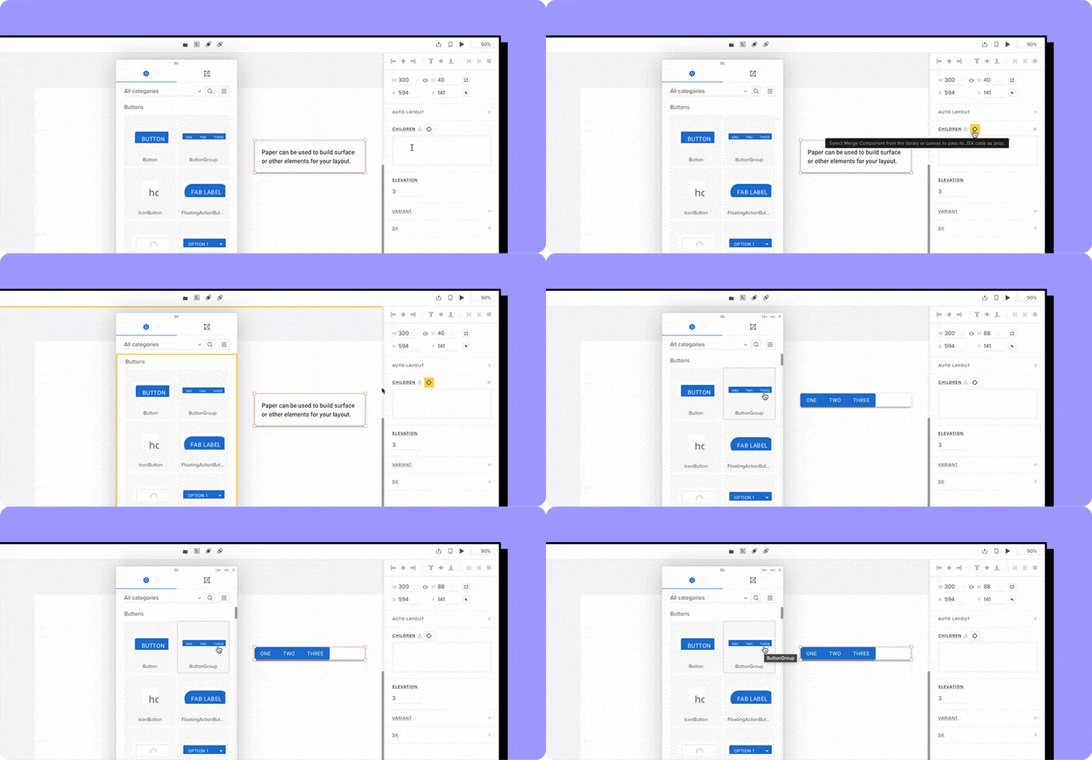
The gap between design and development is shrinking thanks to tools like UXPin Merge that helps you build UI with React components, making prototypes functionally accurate from the start.
This shift brings a new approach to product design, where designers can create interactive, production-ready prototypes using real code.
If you’re new to code-backed UI design, don’t worry — it’s easier to get started than you think. In this post, I’ll walk you through the basics of UXPin Merge and how it empowers designers and developers to collaborate efficiently using live components.
What is Code-Backed UI Design?
Traditionally, designers would create static mockups and hand them off to developers, who then have to recreate the designs in code. This process often results in discrepancies between the design and the final product.
Code-backed UI design flips the script by letting designers work with actual code from the start. Instead of static representations, you’re working with live components — ensuring that what you design is exactly what developers will build.
This is where tools like UXPin Merge come into play.
Merge lets you bring React components — either from open-source libraries or your own codebase — into your design environment. The result? Fully interactive, real-code prototypes that behave exactly like the final product.
Why Code-Backed UI Design Matters
By using React components in your designs, you close the gap between design and development. This offers several benefits:
- Consistency: Your designs are always in line with the production code.
- Speed: Skip the back-and-forth handoff process — designers and developers are working from the same components.
- Accuracy: What you see in your prototype is what developers will implement, reducing rework.
- Collaboration: Both teams speak the same language (code!), making collaboration smoother.
How to Get Started with Code-Backed UI Design in UXPin Merge
Now that we understand the importance of code-backed design, let’s dive into how to get started with UXPin Merge. UXPin Merge is designed for both technical designers and developers, making it easy for anyone to use.
1. Start with a Component Library
When you first log into UXPin, you’ll notice that it comes preloaded with three trial kits: MUI, Ant Design, and Bootstrap. These are popular open-source component libraries that you can use to build interactive prototypes right away.
For example, if you select the MUI library, you’ll have access to a variety of ready-made components like snack bars, cards, and skeleton loaders. You can browse through these examples or even check out pre-built full dashboards for inspiration.
This is a great way to get started if you’re new to code-backed design because you don’t have to build anything from scratch. You’re already working with real components that developers use, so you’re designing with production in mind from day one.
2. Customize and Experiment with Components
One of the best features of UXPin Merge is that you’re working with real React code. Once you’ve selected a component, you can edit it just like a developer would. Each component comes with different variants (like button styles or input field types), and you can easily toggle between them in the UXPin editor.

For example, you can drag a button component onto your canvas and see all the available variants — like different sizes, colors, and states (e.g., hover, disabled). You can even link to the original documentation for reference, so you’re always working with the correct implementation.
3. Use Custom Code Components
UXPin Merge doesn’t limit you to pre-existing libraries. You can also bring in your own custom code components — making it perfect for design systems. For instance, with Tailwind UI components, you can simply paste in the code, and UXPin will generate the entire component on your canvas.
This means you can skip tedious design steps and just plug in custom-coded components to build UIs quickly. For example, if you have a pricing section component, you can paste the Tailwind code, and UXPin will generate a fully functional UI on your canvas instantly.
4. AI-Powered Component Generation
If you want to take things even further, UXPin Merge integrates with AI to generate code components. Using a simple text prompt, you can create a code-based UI component in seconds.

For instance, you can type “Persona Card” into the AI tool, and UXPin will create a working component directly on your canvas.
Currently, this feature supports Tailwind CSS, but more libraries are expected to be supported soon, making this an exciting addition for the future of design automation.
5. Handing Off to Developers
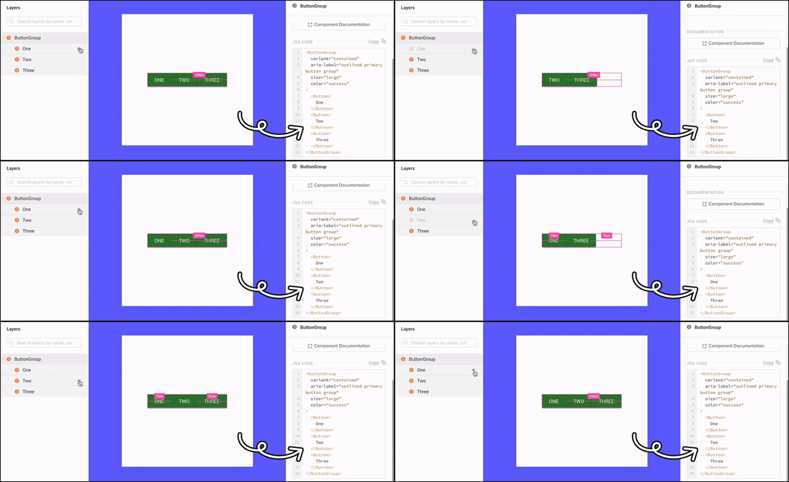
The best part of code-backed UI design is how smooth the developer handoff process becomes. Once you’re finished with your prototype, you can share it with developers using a preview link. With UXPin Merge, developers can access the actual JSX code, dependencies, and functions for every component in your design.

They can even copy and paste the code directly into their development environment or use tools like StackBlitz for more advanced integration. This ensures that the final product is a direct reflection of your design, with no discrepancies between design and code.
The Future of Design Is Code-Backed
Code-backed UI design is changing the way designers and developers work together. Tools like UXPin Merge are leading the charge by making it easy to integrate real code components into your design process. Try UXPin Merge for free.
